This year I have been almost 10 years in the games industry and wanted to share my ideas and answer questions that I have gotten over the years but didn't get to answer. Hopefully my blogpost will inspire you and help you find your way within the industry or maybe even help you find your niche?
How did you get into such a cool IP as Horizon? What sort of brought you in this direction?
Back in 2012 I was already an intern at the studio, a couple of years before I rejoined in 2014, however during my internship I did see some early concept art for this new IP now called Horizon. When I was about to join the team I didn't know for sure which project I'd be working on but, as you can imagine, I had my suspicions. Back then I was mostly working on assets or environment-art but was also looking into creating shaders and material expressions. This technical interest landed me the shader/texture artist position and started delving deeper into this area of expertise over the last couple of years.
What was your general approach to assets in this production? You’ve had quite a tricky task, building all those amazing materials. How did you decide to tackle this?
During the concept phase there were already a whole lot of reference images available (collected by our talented Concept-Artist and Directors) but also my Art-Director had specifications of what he was looking for. The target was to blend this look from the proposed Concept Art and the requirements of the Environment-team/Art-Director(s) and of course I had my own input. From these reference images I have created a huge reference sheet with everything I found interesting per image and from there we picked and chose which characteristics we liked and added callouts to highlight what we felt was necessary to sell the idea of the materials. This really helps to get everyone on board with the exact look we were going for.For any artist I'd suggest; always try to collect images to build your own material library, this can be Pinterest or snapshots on holiday. I do this and then after one or two years, I delete everything and refresh my entire collection.
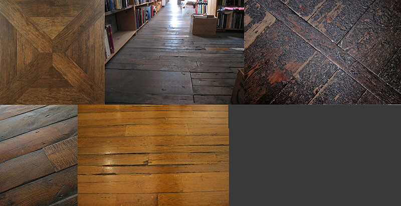
Ref images
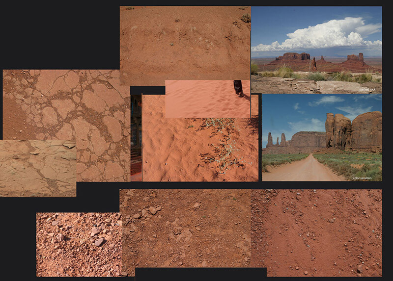
Ref images
You were using Photoshop and ZBrush to craft all those amazing textures. Could you talk in more detail how it all worked?
During the development of previous projects we worked with high poly sculpts in Zbrush to generate detailed heightmap information from those. But when we started implementing Substance with a few textures to get a feel of the program and its workflow. For example with a gravel texture, we generated tiny pebbles and added multiple stacks with offsets and a variety of scaling to make it look more interesting and finalize it with some photo overlays and color correction in Photoshop.
No matter which program or tool we used, we always focused on getting the height information correct first, before diving into the Color and Roughness values too much. For some textures it felt more comfortable to generate the content in Zbrush as it gave me complete control per brick (or had to match with pre-existing assets/models), I was able to put each brick at an angle or give it height differences to give it some nice parallaxing effect. The downside was: it’s very time consuming. For texturing the albedo/diffuse we tried several approaches, for example: polypainting the bricks in zbrush but we had to keep such a high polycount that Zbrush became unworkable and too little poly density would result in a lack of detail. Then we used Photoshop but now that Substance expanded their libraries a lot is possible now, that wasn't before. I would've picked up a hybrid approach, generated high poly mesh and generated the diffuse and roughness in Substance.
You’ve mentioned that you choose Photoshop because of more control over the subtleties in color/height variation. Why was this more important to you? I mean you could have gotten very similar results Procedurally.
In hindsight I probably could have pulled off a similar result. As the height information was the most important to me, it really sold the textural details and state of the bricks and ultimately sold the believability of the material. In the reference images that were collected, it showed me the importance of all the states of decay that were having subtle tonal variety and height values.
Timelapse of focusing on the height information first.Before adding diffuse/roughness.
How did you make these materials tile in such a beautiful manner? Did you use some other tools to scatter the rocks here and other little things?
With a bit of planning and proper mesh setup, you can easily offset your subtools and align them so it’s tiling perfectly (especially now with Substance Designer in our arsenal). Getting the scale right versus the right amount of detail and uniqueness is tricky. Each brick was placed as a unique subtool, so it could easily get warped and moved around. We iterated many times on the brick layout to get the right feel before we proceeded with the Diffuse/Albedo/Roughness maps.
The scattering of rocks was a combination with custom Maya scripts where I could scatter kitbashed rocks or in Substance Designer. Scattering rocks with photo scanned data was interesting to familiarize yourself with generating procedural content and also match it with pre-existing photoreal content.
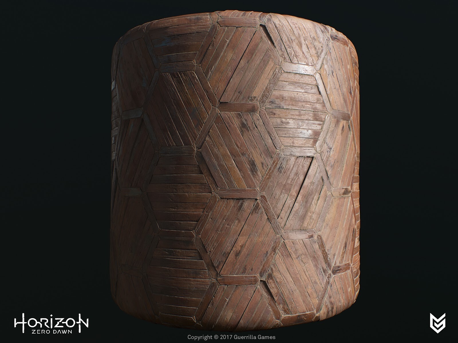
You’ve done some absolutely stunning work with the brick wall. It’s like the most favorite subject of every texture artist, but your material is something else. Can you tell us, how did you manage to build it in such a way that the brick wall actually has information about 3 types of bricks: old, worn down and new.
Planning was very essential for this to succeed. First we started blocking out the intact version of the bricks and tested the look and feel of the layout in-game. We checked for scale, height variation, repeating elements - even a flat color in the albedo with some curvature and ambient occlusion information can help a lot visually to give a feel of the surface and readability over distance.
I then reworked the high poly sculpt and baked out maps for the first pass - I grab all the baked maps, e.g. Position to World Space Normals, custom mat caps in Zbrush. This gives me a wide variety of masking methods I can pick and choose from to create the tonal variety. Blending the Curvature map with the Position map and a random (brick) variation mask, created interesting variations. Next step is to apply more colors by adding photos, mask out bricks based on height or manually select them, add tonal gradients with the HSL slider/node for per brick subtle variations.
For the second material we used the exact same layout in Zbrush and started to replace bricks of the same size or used the well known Dam standard brush or Orb Crack brush combined with a custom alpha mask to split up the bricks or use the TrimSmoothBorder brush to soften the edges (as worn brick does over time). On certain bricks we would add some alpha stamps to make the brick look more damaged. Or by moving some bricks even lower and skewed which emphasized the aging process even more.
How did they help you to nail that beautiful hard surface stuff?
Maarten (Art Director) and I were looking for a way to speed up the texturing process but also maintain the quality that was pushed throughout the game. The two of us decided to delve deeper into the Substance packages and set up custom nodes and materials which also extended our internal Substance library. During this iteration process of creating nodes and testing them, we created a smart material that we could apply to almost all the assets. In 90% of the cases it would get us there and in some cases there were some tweaks needed but it sped up the art creation process quite a lot. Between the two of us we managed to export 45-ish component sets within two days with all the latest smart materials updated and correct masking for detail maps.
How did you work on those wonderful rusty elements in the production? How were these set up? What were the challenges in these assets?
The rusty element was an iterative process of creating custom Substance nodes. First, we started making generic materials with some light wear, tear and discoloration. In the second iteration, we started adding things like dust, dirt and rust. To get the realism we were looking for, we worked on custom mask generators, e.g. rust got stored into its own user-channel, which took Ambient Occlusion and Curvature in mind. With an additional custom node, we can generate streaks based on the rust mask user-channel, this gives us the drips and very long streaks.
Over all, to finalize, how did these materials help to tell the story in the environment? Why do you think they are even important for these humongous productions?
Material expressions are supposed to give the player the idea that they are in a believable world, that it becomes almost tangible. If a material looks ‘off’ it will break that illusion and snap the player right out of the immersion. The materials will tell the story the world is being lived in, it shows age and beauty. But also the interaction between materials, how water affects wood or metal for example or what erosion does to rocks or bricks. No matter how large the production environment is, you can do this kind of environmental storytelling in all sorts of ways.


